Packaging Design
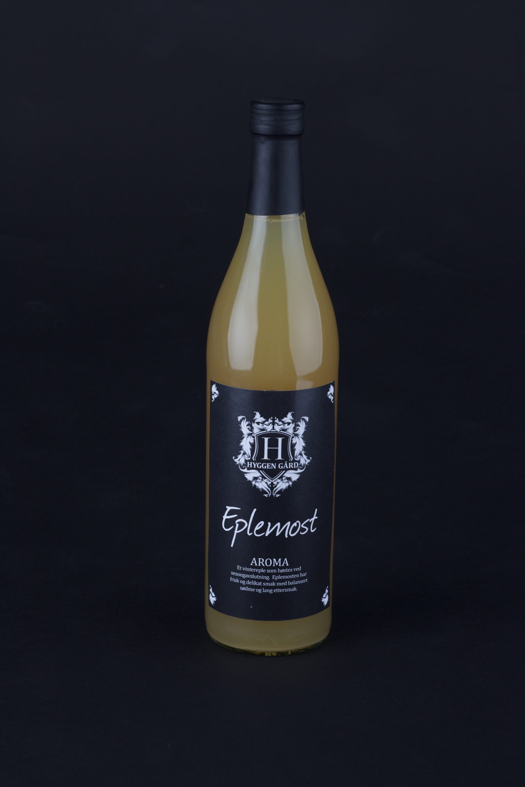
Hyggen Gård Eplemost
Brief
Background of Hyggen Gård
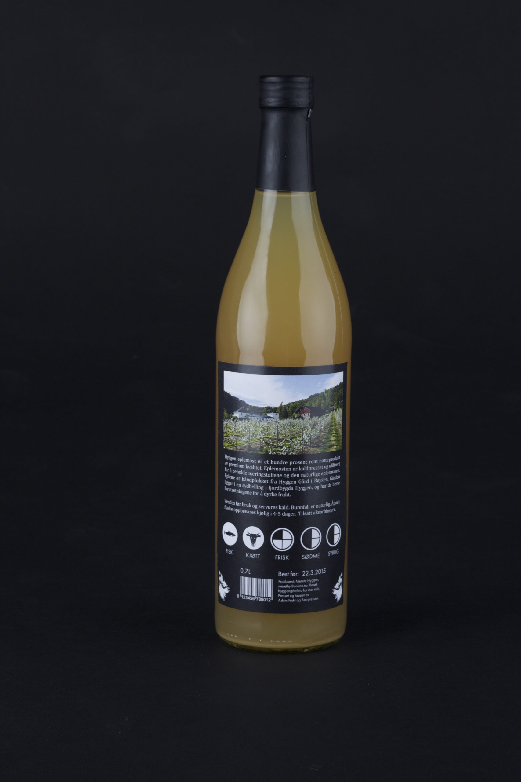
Hyggen is a small village in Røyken municipality. The farm lies on the southern slope down to the Drammen Fjord and has the best conditions for cultivating fruit and berries. There has been traditionally farming, forestry and quarrying for generations. Today, the 6th generation has taken over and operates the farm in fruit production. This is a collaboration between Herman Andreassen, Jonathan Mällberg, Øystein Engell and myself. We had an assignment at the University College of Southeast Norway where we had to redesign an optional product from the food store.
Coat of arms
The logo is based on coat of arms, which have been used as a hallmark for families and businesses since antiquity. We associate coat of arms with tradition, quality, solemnity, authority and history. It creates a stamp of quality and integrity that will strengthen the credibility of Hyggen Gård as an apple producer.
Heraldic symbols
We have used heraldic symbols that surround the shield to create a solemn and traditional touch, which also reinforces the shield expression. The heraldic symbols creates movement with organic shapes and stands in great contrast to the typography and shield. The initial (H) in the middle of the shield is Kepler Std display and stands firm as a clear symbol, Hyggen Gård is set in Cambria Bold. It`s in uppercase letters to increase the readability and create a form that is easier to place.
Concept
Fresh, unfiltered and 100 % natural apple juice of high quality.